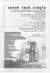
Fifth anniversary advert artwork
 From time to time I’m filled with an altruistic urge to give today’s design students with their tablets and their hats and their ironic drinking vessels an insight into the almost medieval world of early ’90s graphic design*. So here’s the original artwork for our fifth anniversary ads: we splashed out on typesetting (in Cliftonprint’s “avant garde” typeface – a lot of our sleeves use avant garde, as Cliftonprint didn’t have much else) for the releases, but the rest is just typed and then photocopied at various sizes. What looks like white poster paint is white poster paint – to seal the edges of the stuck-down bits and avoid shadow marks when the final version was photocopied at Hatcher’s (local tobacconists) before posting to the NME and Melody Maker.
* And also to let them know they don’t know they’re born.